Component templates & styling APIs
I recently revisited a talk write-up I did from 2017. It was the first time I had publicly articulated some of the foundational thinking behind what would become Components AI and CSS GUI . What follows is a bit of an update and a bit of a rewrite. Original post here.
TLDR;
What if we create component templates with declarative styling APIs as a design process?
- Create a tree of DOM elements
- Define sets of CSS properties to expose for styling
- Configure smart ranges of values for each property
- Generate all the cool designs
- Share your templates with others so they can generate designs with their own content and themes
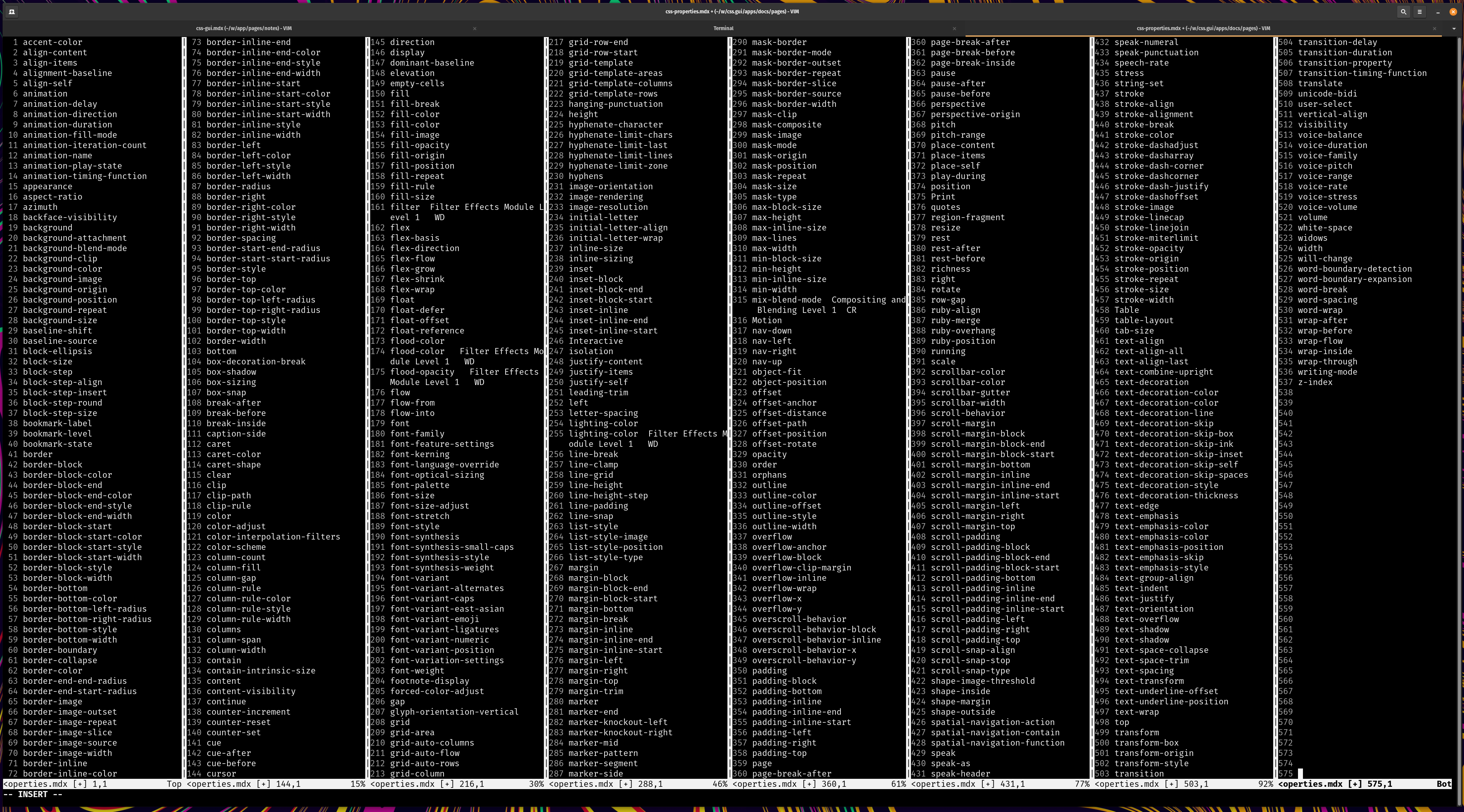
Below is a list of CSS properties. I often think of CSS as the styling API for HTML. At first glance it's a long list.

The good news is that you can build a lot of wonderful looking UI without understanding or knowing about a lot of these properties and how they work.
“The parameters comprise sequences which are theoretically infinite but limits are, of course, set to them in practice. There is an upward limit to size and certainly a downward one... Within these sequences there are reasonable bounds; extremes set by technical and functional experience” Karl Gerstner - Designing Programmes
Gerstner wrote this in 1963 but he sounds like he would have had some pretty rad approaches to CSS development.
If you are styling a button, many of the above properties won't be necessary. And within the relevant properties, there are many values we can likely eliminate by default. I can confidently say, when styling a button, I've never needed to set caption-side, counter-increment, counter-reset, or volume. This doesn't mean you would never need these properties, but they aren't common for the task of styling a button.
Can we use this line of thinking to potentially make front-end code more accessible for new people? What would an interface design tool look like that took this type of context into account?
Components could expose all of the relevant visual styling properties by default, but still allow a user to add or remove any properties to experiment with what is possible. The goal is not to restrict what is possible creatively, but to reduce the noise and increase focus on what is likely to matter.
Component templates and styling APIs
How might we codify this thinking into something that could improve our design workflows for digital screens?
A designer could create a component template. This would be a tree of DOM elements and a set of properties they would use to style a component. This might come with a set of smart defaults pre-configured that are modifiable. We will call this declared set of properties and a set of pre-configured ranges as the component styling API.
One benefit is that if you have a collection of component templates, anyone styling or designing doesn't have to start from a blank slate. Both domain experts and non-domain experts might discover things to account for they might not have otherwise. The pseudo state :focus for interactive elements would be tough to know about if you've never worked on the web or studied accessibility. But if we make it a part of the configuration, we can help make this knowledge accessible to others.
This concept is not new. In programming, an API can be an effective way to codify and communicate what is possible with a function. Consider this definition from Wikipedia:
API: Application programming interface
"In general terms, it is a set of clearly defined methods of communication between various software components... By abstracting the underlying implementation and only exposing objects or actions the developer needs, an API simplifies programming...Thus, the design of an API attempts to provide only the tools a user would expect."
The goal though is not to eliminate options, it's to narrow focus on the essential, allowing for expansion and exploration if necessary.
The most influential tip on how to think about designing a component I've ever seen is from Nicole Sullivan's excellent article The media object saves hundreds of lines of code :
"When I’m building a new object, the first thing I do is to figure out which parts are reusable components, and define what I know and do not know about them...For example: Can be nested, Optional right button, Must clearfix" - Nicole Sullivan
I have found this to be a wonderful process for designing and developing components. I think if we expand this concept to possible ranges of values for each property we have a foundation to leverage parametric and generative design to open a whole new world of creative possibility.
So what might this look like?
Step 1: Component template
We could define a template for a button styling API. The first step is to define some markup. Here we only need a single element, but we could declare a tree of elements to make a more complex component.
Now we are ready for step 2.
Step 2: Component styling API
Next we will decide which CSS properties we want to add to our styling API. To start small, let's add color, background-color, font-weight, and border-radius to the API for this button. Note: the language, style, and format of the code aren't important, there are lots of ways to implement these ideas.
A button is an interactive element so we can customize the styles for active, focus, and hover pseudo classes. Our base API includes 4 properties. Now we must decide, are there any additional properties we want to add to these pseudo classes? Are there any properties we don't want to include?
Changing color and background color on hover and focus is common and can result in an aesthetically pleasing design, so we will include those. Border-radius is less common to change but it can be done in a nice way. We'll leave it out to keep this example simple. Changing the font-weight of a button on hover is not common and is most often the result of a bug in CSS so we'll leave it out for now.
By default buttons get an outline when focused. We can add outline properties to the focus pseudo class.
Step 3: Themes
A theme file is a common way to store information about available design options for color, font sizes, type faces, and other visual styles. We might consider a theme as a set of design constraints we can use to inform the inputs we pull into any component template. If we are designing a button at a company we are likely to be using their brand colors and other existing visual styles.
We can view a theme as a way to declare all potential inputs for a generative design system.
This is where I think things get really interesting. Automating a pipeline to connect themes with component templates and styling APIs is where the real magic awaits.
Step 4: Generating all the designs
Combining different themes with a component template or block of markup, we have the building blocks to create new types of parametric and generative design tools to rapidly iterate through what is possible. We can generate all possible combinations and permutations from a theme and spit them out into a scrollable canvas or allow people to explore manually with parametric controls.
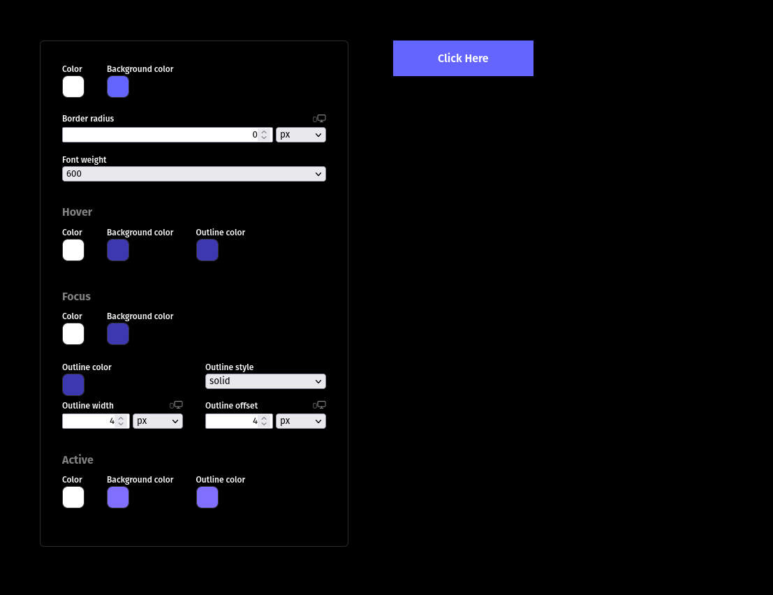
If we review our styling API example above, it might not look like much. But it's enough information to generate a custom parametric design tool with some generative functionality. This is a screenshot of a demo build with CSS GUI.

While this is a simple example - we can extend these concepts to more complex markup structures with more exposed styles and use them to quickly visualize different design options.
These types of workflows seem particularly relevant as we see more and more headless UI libraries available .
Step 5: Sharing and the future
As tools like CSS GUI , Leva , and dat.gui continue to develop and progress we will likely see an increase in tooling to support these libraries and the types of novel workflows they afford. Even though we've been working on the web for decades we still have lots of room for exploration and evolution in how we create digital experiences. Parametric and generative workflows are exciting because I truly believe they can help expand what is possible to explore with CSS as a material for experienced developers, but also make CSS even more accessible to people who don't write code.
Our team is currently working on a way to streamline the process to create component templates and styling APIs without writing any code using CSS GUI . We're chipping away and would love help and feedback.
Contribute or follow along: