Color
With our original color component, users could upvote or downvote a randomly generated color to train suggestions for other components. The canvas preview showed the color as a background and a set of simulations for various color vision deficiencies.
Because color can be used in a variety of ways, we've added more contexts to preview a color's potential usage. We've also added preview components for applying color to text, borders, gradients, and blends.
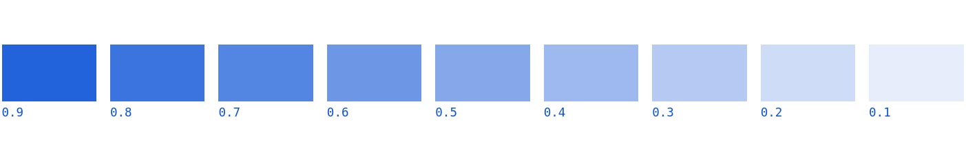
Opacity
Preview your color applied to a linear opacity scale.
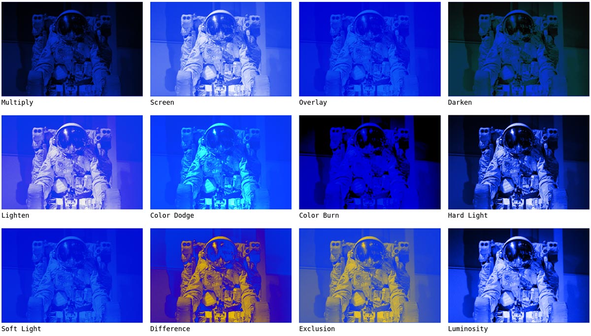
Mix blend modes
Visualize how you can blend black and white photos with your brand colors using a set of blend modes available in CSS.
Visual deficiency preview
Appearance of color varies greatly from person to person. Preview how different people will see your designs with our simulations for various types of color blindness.
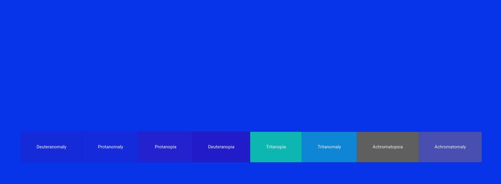
Previews included for:
- Deuteranomaly
- Protanomaly
- Protanopia
- Deuteranopia
- Tritanopia
- Tritanomaly
- Achromatopsia
- Achromatomaly
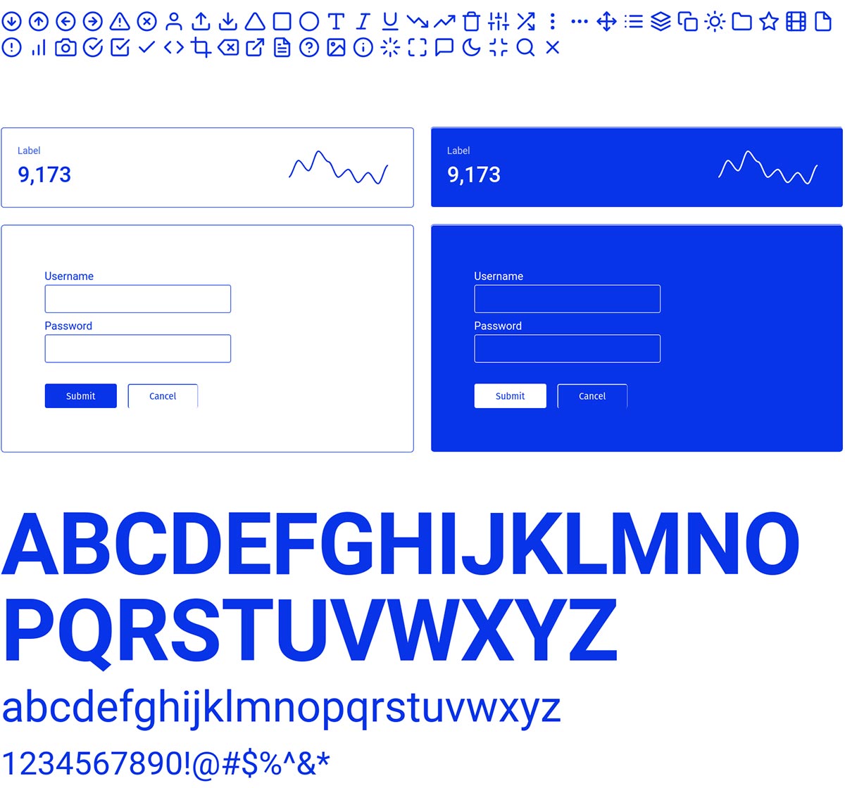
Typography & UI
View simple UI elements, including a typography preview with upper and lowercase characters. Background colors are selected automatically based on accessible contrast thresholds.
Gradients
Preview potential gradient styles, shifted for lightness, darkness, and hue.

Roadmap
- Additional UI component previews
- Box and text-shadows
- Usage stats across the web
- Closest color for Pantone, Copic, and Prisma color markers
- Closest CSS color name
- Configurable preview photos
- Configurable gradients