Theme builder
We've opened up log in and released the alpha version of our theme builder. Create an account to save multiple themes as well as easily track your publish and edit history for components. Build themes by importing existing site styles, customizing curated templates, or starting from scratch.
Theme import
It should be easy to utilize your existing visual brand. Via the CSS Stats API, we automate parsing visual styles from CSS, which sorts your colors, typography, shadows, and borders into scales you can edit as needed.
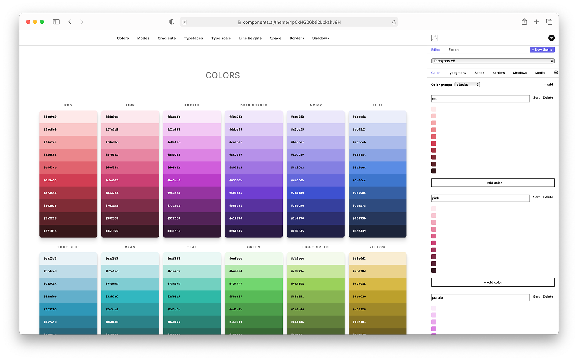
Color systems
Build accessible and balanced color systems. Jump-start your designs with a growing set of theme presets, or import your existing colors to use as generative input for other components.
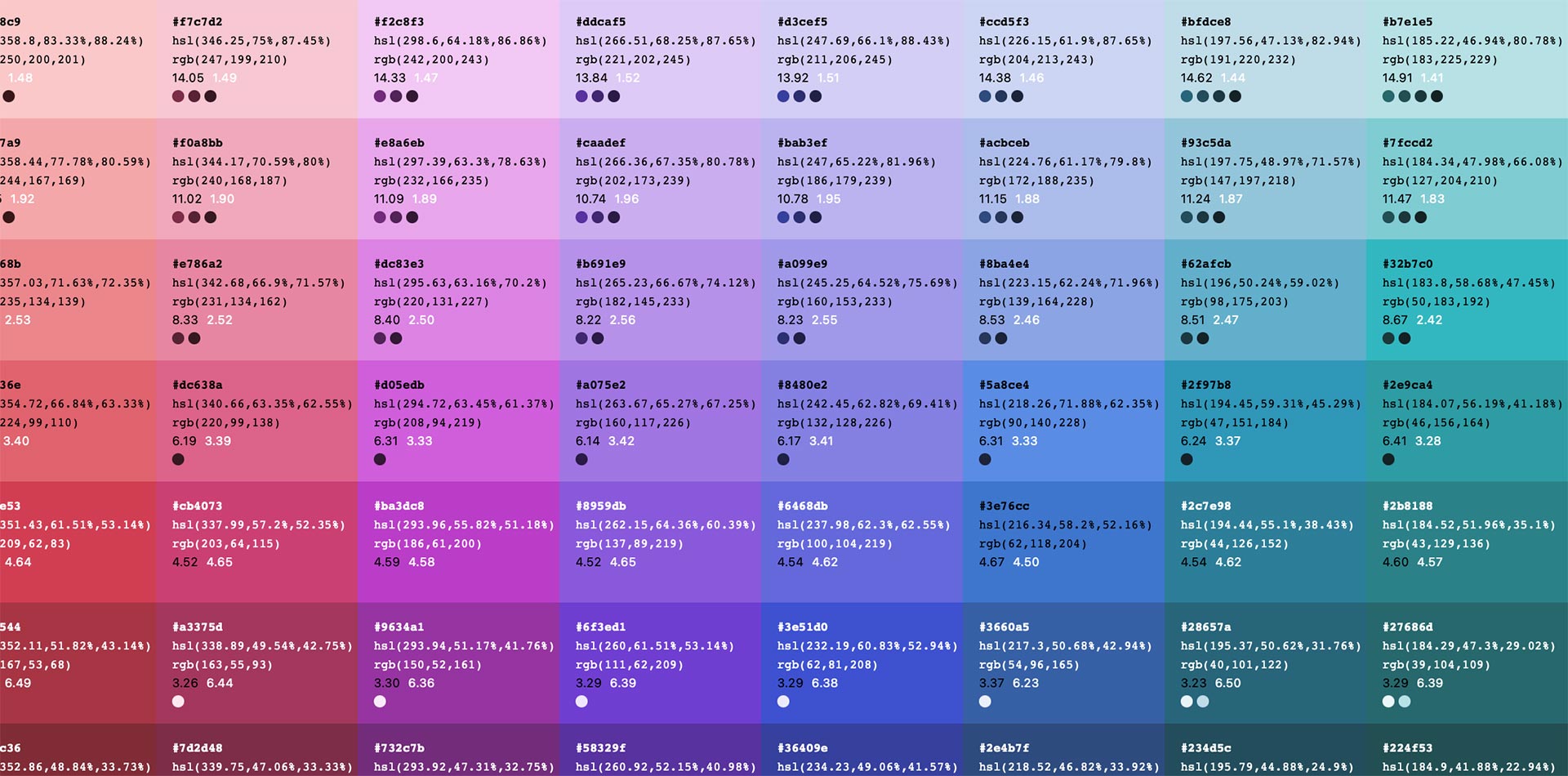
Automated accessibility info
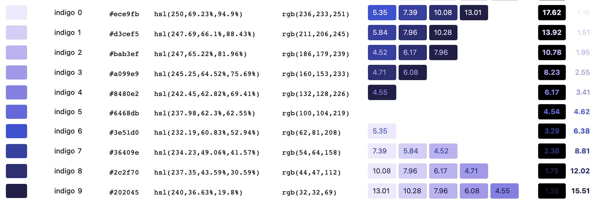
As you build your color system, get a variety of automated documentation and visual feedback loops that allow you to navigate accessible ways to use your color palette. Automatically see accessible color combos from within each color group as well as the color contrast scores with both black and white.
Color modes
Generate, customize, and visualize complex ways to combine colors to build UI beyond two color combinations for text and background. It’s never been easier to explore dark mode options.

Gradients

Using our generative algorithms, explore what’s possible with CSS gradients and your color palette. For more complex gradients check out our gradient component.
Shadows
Generate box shadows and preview their application on cards, buttons, images, and more.

Design for the web with web values

Build modular scales for spacing and typography to create fluid systems with the units of your choice.

Constrain to theme
Existing components and our in-flight component builder allow you to constrain generative inputs to values from your theme. While you can always choose a custom value for one-off needs, we're working to make it as easy as possible to apply existing theme values to new designs.
Publish
Publish a visual style guide along with hosted assets you can use directly in your app. Consume your theme as JavaScript, JSON, or CSS. Easy to use with Styled System and Theme UI.
Multi-format export
You should be able to seamlessly use your visual brand anywhere. Export your theme as JavaScript, JSON, Responsive utility based CSS, CSS variables, and Sass variables. We want to help make your theme as interoperable as possible.
Get started here. We can't wait to see what you make.
Roadmap
- Advanced color scale creation and editing controls
- Support for variable fonts
- Custom font support
- Documentation for all accessible color combinations across groups
- Figma plug-in for theme generation and style documentation
- Custom domain publishing
- Typography styles composer
- Animation properties
- Animation composer
- More curated presets
- Imports (images, JS, CSS, Sass, JSON)
- CSS export config
- Inline editing controls for shadows and gradients
- Command Z undo
- More preview options for colors, gradients, shadows, borders, and more
We'd love to hear about your computational theming needs. Drop us feature requests or issues here.