Aa
The open-source design tool
for creatives
Build custom design tools without writing any code. Create responsive components, pages, and sites that you can use in any type of web project. Style markup templates with curated themes or your own design tokens.
Studio
Visually design custom design tools, generative components, pages, and sites
🎨 Theme
Import or define design tokens to use in all of your designs. Dedicated tools for creating accessible color systems, responsive type scales, layered box shadows, and more.
Markdown_
Publisher
Generative styles + markdown
Syntax highlighting
Customize the look of your code examples
Color scales
Scale-based palette generator
Color
Preview colors against common UI
Product
A growing set of generative components for UI and graphic design.
Explore
Cycle through generated designs or create your own from scratch with the ease of parametric controls.
Augment
Manipulate parameters until the design is just right. Lock inputs for properties or combinations of properties you like to find your visual language.
Navigate
Vote generated designs up or down to curate future output. Save as many iterations as you want.
Multi-format export
Export designs in a growing list of formats including: React, JS, JSON, JSX, SVG, PNG, HTML, CSS, CSS custom properties, and Sass.
One-click publish
Instantly share your designs with colleagues or clients to present or collaborate. Publish hosted web pages along with hosted assets for styles as JS, JSON, and CSS.
Constraint-based designs
Design with scales and systems. Components automatically use your defined brand guidelines, retaining the ability to override with custom values at any time.
Theme import
Start using your visual brand immediately. Audit and edit or use to drive constraints for generative components.
Automated accessibility docs
Rapid visual feedback loops for contrast scores and accessible combinations available in a theme.
Responsive themes
Don't just design for a single screen size. Easily target values across your defined breakpoints. Manage responsive typography, layout, and spacing.
1000+ fonts
Full support for the entire Google Font Library + any fonts you have installed locally.
Variable font support
The first design tool with full support for variable fonts. Automatically exposes all custom axis so you can get the fine-grained control variable fonts were meant to enable.
Curated design assets
Browse curated presets to customize or use in your designs.
Used by thousands of creatives at places like
Explore
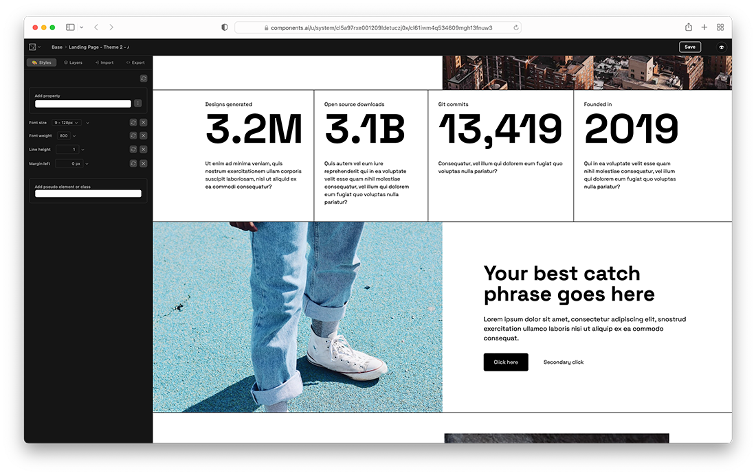
A gallery of responsive components that are easy to customize

Theme import
Create a theme from your existing website's visual brand. We'll parse your CSS for colors, typography, motion, shadows, and spacing values to use as design tokens.
Themes
Modular scales for color, typography, shadows, and motion, optimized for designing digital interfaces. Easy to modify or extend to fit your brand. Export as CSS, Custom properties, JS, JSON, or Sass to use in any type of web project.


Notes
Workflows powered by generative design
{ css.gui }
CSS.GUIA growing collection of open source visual editors for CSS.Read more

Components AI.Read moreGenerative Logo DesignA brief walkthrough of the thinking and process behind the design of our generative logo.Read more
Aa
Computational Theming: ColorAn introduction to computational methods to ensure your designs are visually accessible.Read moreLearn CSS
Use Studio to explore interactive and editable examples that you can use to rapidly learn how CSS works for each property.
border-radiusbackground-image: gradientsbox-shadowT
text-shadow